Notebook Illustrations
Why Bother?
There are two main reasons why we require you to do notebook illustrations.
- To draw something well, you must take the time to slow down and look at
it analytically. You cant just glance at it and think that you know what
it looks like and think you will remember it. Drawing things trains your
brain to
be more observant of the world around you and to notice the picky
details it might otherwise be used to just filtering out and ignoring.
A doctor or pharmacist working with a patient or a biologist working with
plants and animals in the field or petri dishes in a lab must be able to
pick up on the minute nuances of the situation in order to fully understand
whats going on at that point in time. Thus, this observational skill is
something you will need to develop in order to do well and be successful
in your chosen career.
- There is a hand-eye-brain connection that can help you to learn the
required course material, thus helping to improve the amount of material
you retain and remember in this course, thereby hopefully also improving
your grades. If you take the time to analyze and draw something, your
brain should remember that you took the time to do so and what you did.
Then, later, during a test, hopefully, your brain should recall the mental
picture and memory of you drawing the item, and from that, also recall the
memory of the details of what you drew.
But, Im Not an Artist!
Nobody is asking you to be one. Actually, Ive seen notebook
illustrations that were heavily shaded around the edges to give a more 3-D
appearance and of which all the other students in the class were envious
because they looked so good, but in reality those illustrations were missing
important, key details and the overly-heavy shading obscured other important
parts of the item being drawn. The point of requiring you to do notebook
illustrations is not merely to practice being artistic, or whatever, but
rather to allow/encourage/(force?) you to be observant. It doesnt
take being artistic to take the time to observe that something is twice
as tall as it is wide or that six of the blue things youre seeing under
the microscope, if laid side-to-side, would fill the width of the field of
view. Its not about being artistic, but rather, all about taking the time
to be critically, analytically observant of what youre seeing.
Here are some examples taken from several past lab notebooks.
Ive purposely left peoples names off to avoid embarassing some of them.
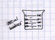
 On the left is an illustration of a beaker thats way too small and thus,
theres not enough room to show the necessary details, so the person just
quickly drew in some lines. On the right is an illustration of a beaker
thats larger, so there was room to draw the lines. Thats much better.
However, the illustrator didnt leave as much space at the top as there
actually is. The illustration could have been further improved by lining
the lines of the scale up with the lines of the graph paper.
On the left is an illustration of a beaker thats way too small and thus,
theres not enough room to show the necessary details, so the person just
quickly drew in some lines. On the right is an illustration of a beaker
thats larger, so there was room to draw the lines. Thats much better.
However, the illustrator didnt leave as much space at the top as there
actually is. The illustration could have been further improved by lining
the lines of the scale up with the lines of the graph paper.
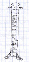
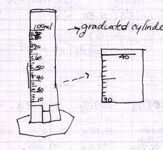 On the left is an illustration of a graduated cylinder that, again, is way
too small to have room to show the necessary details. On the right is one
illustration of a cylinder thats fairly larger and shows more detail. Also
on the right is an illustration that shows another, optional way to indicate
the actual markings by enlarging and showing the detail of a section of the
scale. Both of these are fairly good, but both could have been improved by
making use of the graph rulings on the paper to line up the lines of the
scale.
On the left is an illustration of a graduated cylinder that, again, is way
too small to have room to show the necessary details. On the right is one
illustration of a cylinder thats fairly larger and shows more detail. Also
on the right is an illustration that shows another, optional way to indicate
the actual markings by enlarging and showing the detail of a section of the
scale. Both of these are fairly good, but both could have been improved by
making use of the graph rulings on the paper to line up the lines of the
scale.
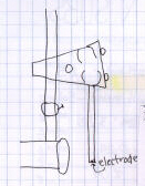
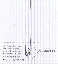 Here are a pair of illustrations of a pH meter electrode. Again, notice the
one on the right shows details of what makes it look like an electrode and
has all the parts labeled, while the one on the left just includes a wiggly
rectangle that could be anything rectangular if it wasnt labeled as being
an electrode. Again, while the one on the right is fairly good, it could
have benefitted from the
use of a straightedge, or at least an attempt to use the lines on the page
as guidelines.
Here are a pair of illustrations of a pH meter electrode. Again, notice the
one on the right shows details of what makes it look like an electrode and
has all the parts labeled, while the one on the left just includes a wiggly
rectangle that could be anything rectangular if it wasnt labeled as being
an electrode. Again, while the one on the right is fairly good, it could
have benefitted from the
use of a straightedge, or at least an attempt to use the lines on the page
as guidelines.
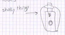
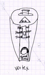 Here are a couple of illustrations of a piece of equipment called a vortex
(not a shaky thingy). Obviously the person who did the illustration on
the right took the time to learn the name of the equipment (s)he was using,
to carefully draw that piece of equipment, and to label the parts thereof.
Here are a couple of illustrations of a piece of equipment called a vortex
(not a shaky thingy). Obviously the person who did the illustration on
the right took the time to learn the name of the equipment (s)he was using,
to carefully draw that piece of equipment, and to label the parts thereof.
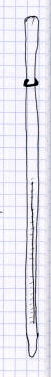
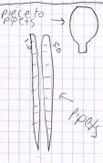
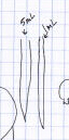
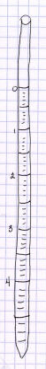 Heres a riddle: how do you tell the difference between a thermometer, a
pipet, and an earthworm? The illustrations on the left (one allegedly of a
thermometer and two allegedly of a pair of pipets) look pretty-much identical
to other studentss earthworm illustrations. The illustration of a pipet on
the right is a bit better. It shows the actual markings on the pipet, but
theyre not evenly spaced like they should be: the milliliter from 4
to the end looks larger than the milliliter from 0 to 1 (again, use the
graph rulings on the page to help get things spaced evenly), and there is
other information at the top of the pipet thats missing in this drawing.
Heres a riddle: how do you tell the difference between a thermometer, a
pipet, and an earthworm? The illustrations on the left (one allegedly of a
thermometer and two allegedly of a pair of pipets) look pretty-much identical
to other studentss earthworm illustrations. The illustration of a pipet on
the right is a bit better. It shows the actual markings on the pipet, but
theyre not evenly spaced like they should be: the milliliter from 4
to the end looks larger than the milliliter from 0 to 1 (again, use the
graph rulings on the page to help get things spaced evenly), and there is
other information at the top of the pipet thats missing in this drawing.
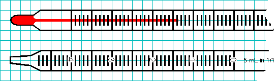
 Of course, if someone was actually trying to draw an earthworm, the segments
might look more like this,
Of course, if someone was actually trying to draw an earthworm, the segments
might look more like this,
while a thermometer and pipet might look more like this.
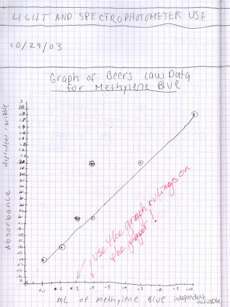
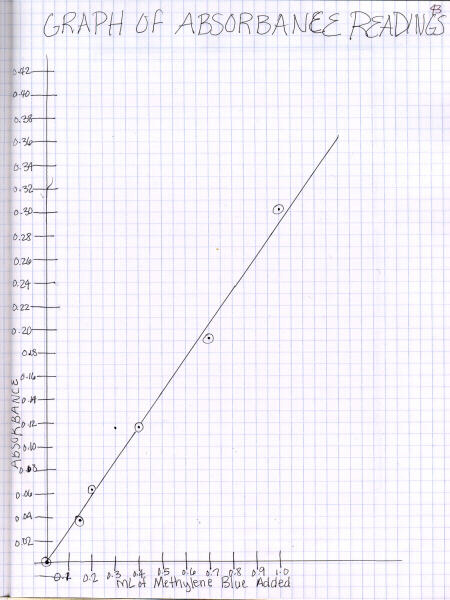 While graphing technique is covered in more detail on the
graphing Web page,
here are a couple examples of a poorly-done and a more-correct graph.
While graphing technique is covered in more detail on the
graphing Web page,
here are a couple examples of a poorly-done and a more-correct graph.
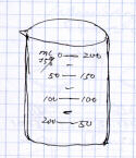
To Draw This Beaker...
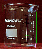
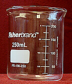 Here is a 250-mL beaker. Notice several things about
this beaker. While it is labeled as being a 250-mL beaker, notice that the
lines only go up to 200 mL. Where do you suppose the 250-mL mark is? Take
time to look closely at the lines marked on this beaker so that you understand
how many milliliters of liquid each line represents.
If you want to draw this beaker in your lab notebook, here are the steps
you might take to insure the quality and accuracy of your drawing:
Here is a 250-mL beaker. Notice several things about
this beaker. While it is labeled as being a 250-mL beaker, notice that the
lines only go up to 200 mL. Where do you suppose the 250-mL mark is? Take
time to look closely at the lines marked on this beaker so that you understand
how many milliliters of liquid each line represents.
If you want to draw this beaker in your lab notebook, here are the steps
you might take to insure the quality and accuracy of your drawing:
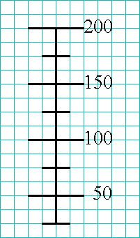 There is a reason why you were required to purchase a graph-ruled
notebook to use as your lab notebook. Use the lines on the page where
you will draw your picture, and dont just ignore them!
As you examine the beaker, notice that the most regular part of it, the
part to which the rest might be compared, is the scale on it.
Thus, start by drawing the scale on the beaker, lining each scale unit up
with a line on the graph-ruled notebook page.
There is a reason why you were required to purchase a graph-ruled
notebook to use as your lab notebook. Use the lines on the page where
you will draw your picture, and dont just ignore them!
As you examine the beaker, notice that the most regular part of it, the
part to which the rest might be compared, is the scale on it.
Thus, start by drawing the scale on the beaker, lining each scale unit up
with a line on the graph-ruled notebook page.
 Then, to get the correct height for your drawing, notice that the top of
the beaker is about two units (equivalent to another 50 mL) above the 200-mL
marking. Draw the top of your beaker at the same relative height (number
of lines) above the 200-mL mark on your drawing. Also, notice that the
bottom of the beaker is approximately one unit (equivalent to 25 mL) below
the 25-mL mark. Draw the bottom of your beaker at the same relative height.
Then, to get the correct height for your drawing, notice that the top of
the beaker is about two units (equivalent to another 50 mL) above the 200-mL
marking. Draw the top of your beaker at the same relative height (number
of lines) above the 200-mL mark on your drawing. Also, notice that the
bottom of the beaker is approximately one unit (equivalent to 25 mL) below
the 25-mL mark. Draw the bottom of your beaker at the same relative height.
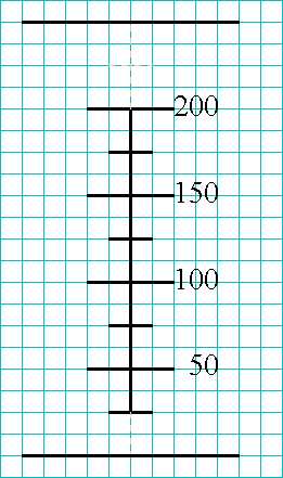
 Now, examine the actual beaker, again. If you imagine the scale turned on
its side, you can see that the width of the bottom of the beaker is a little
over eight scale-units, and the width of the flared top of the beaker is
about another scale-unit wide where the spout is, but only part of a
scale-unit wider elsewhere.
Now, examine the actual beaker, again. If you imagine the scale turned on
its side, you can see that the width of the bottom of the beaker is a little
over eight scale-units, and the width of the flared top of the beaker is
about another scale-unit wide where the spout is, but only part of a
scale-unit wider elsewhere.
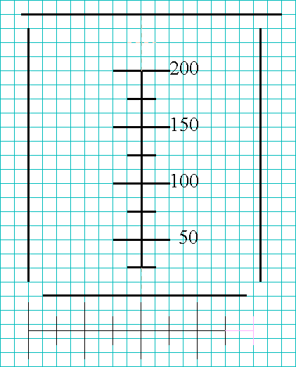 Count over a corresponding number of lines on your notebook page and mark
the locations of the sides of the beaker you are drawing. Then, finish the
drawing by adding the rounded corners and any other significant features
(such as the fact that this says it is a 250-mL beaker).
If you take the time to carefully and analytically observe the
beaker you are drawing, your drawing will both more closely resemble what
you are trying to draw and be better artistically. Remember, its not
about being a good artist, but rather, about taking the time to be
observant.
Count over a corresponding number of lines on your notebook page and mark
the locations of the sides of the beaker you are drawing. Then, finish the
drawing by adding the rounded corners and any other significant features
(such as the fact that this says it is a 250-mL beaker).
If you take the time to carefully and analytically observe the
beaker you are drawing, your drawing will both more closely resemble what
you are trying to draw and be better artistically. Remember, its not
about being a good artist, but rather, about taking the time to be
observant.
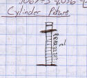
To Draw Something Circular...
 If you are trying to draw and label a circular object such as the dial on a
sphygmomanometer or stopwatch, there is a logical approach that will enable
you to evenly fit in all the numbers on the dial.
If you are trying to draw and label a circular object such as the dial on a
sphygmomanometer or stopwatch, there is a logical approach that will enable
you to evenly fit in all the numbers on the dial.
First, draw your circle and mark the compass points the north,
south, east, and west points on the dial.
Second, observe what numbers correspond to those compass points. In the
case of a sphygmomanometer dial, those points correspond to 80, 160, and
240 mm Hg (actually, the 0 point isnt on a sphygmomanometer, so that can
be mentally included, but not marked on the paper). Those would be the
first set of points you would indicate on your drawing.
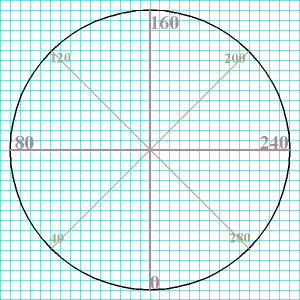 Third, eyeball halfway in between each of the N, S, E, and W points
(determine the 45° points),
and include those numbers (on a sphygmomanometer those would correspond to
40, 120, 200, and 280 mm Hg).
Third, eyeball halfway in between each of the N, S, E, and W points
(determine the 45° points),
and include those numbers (on a sphygmomanometer those would correspond to
40, 120, 200, and 280 mm Hg).
Fourth, each of the resulting spaces would, again, be visually divided in
half to obtain the locations for the 20, 60, 100, 140, etc., points.
Fifth, each of those resulting spaces would, once again, be visually divided
in half to obtain the locations for the 30, 50, 70, 90, 110, etc., points.
Notice, by the way, those are not labeled on the sphygmomanometer.
 Sixth, by the time you have those spaces divided evenly, its pretty easy
to put the four small, evenly-spaced tick-marks in between each of the ten
marks.
Sixth, by the time you have those spaces divided evenly, its pretty easy
to put the four small, evenly-spaced tick-marks in between each of the ten
marks.
Seventh, dont forget to include the needle, arising at the center of the
dial and pointing to an appropriate number.
To Draw A Microscopic View of a Cell...
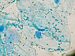 Suppose you were examining these cells under a microscope and needed to draw
one. The first thing you would want to do is consult the protocol to read
the description for this type of cells to determine exactly what youre
viewing and what organelles, etc. you need to find and indentify.
Suppose you were examining these cells under a microscope and needed to draw
one. The first thing you would want to do is consult the protocol to read
the description for this type of cells to determine exactly what youre
viewing and what organelles, etc. you need to find and indentify.
 As you examine these cells under the microscope, you need to decide what is
one cell, and what organelles you can identify. If your brain wants to
dismiss what youre seeing as just a bunch of jumbled-up blue stuff,
ignore that impulse, and force your brain to keep viewing/thinking/processing
until it makes sense.
As you examine these cells under the microscope, you need to decide what is
one cell, and what organelles you can identify. If your brain wants to
dismiss what youre seeing as just a bunch of jumbled-up blue stuff,
ignore that impulse, and force your brain to keep viewing/thinking/processing
until it makes sense.
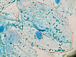
 To get a handle on the proportions of the cell, estimate how many nuclei wide
and tall the cell is. This cell is about 7× wider than the nucleus, and about
6.5× taller.
To get a handle on the proportions of the cell, estimate how many nuclei wide
and tall the cell is. This cell is about 7× wider than the nucleus, and about
6.5× taller.
 Thus, when you begin to draw your picture in your notebook, the cell you
draw should also be about 7× wider and 6.5× taller than the nucleus you draw.
Once again, the graph-ruled lines can help you with this. If, as in this
illustration, the nucleus is drawn two blocks high and wide, the cell would
be 7 × 2 = 14 blocks wide and 6.5 × 2 = 13 blocks tall.
Thus, when you begin to draw your picture in your notebook, the cell you
draw should also be about 7× wider and 6.5× taller than the nucleus you draw.
Once again, the graph-ruled lines can help you with this. If, as in this
illustration, the nucleus is drawn two blocks high and wide, the cell would
be 7 × 2 = 14 blocks wide and 6.5 × 2 = 13 blocks tall.
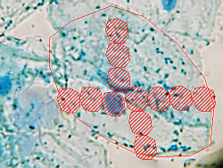
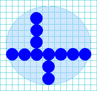
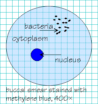 Then, fill in the rest of whatever other organelles and structures are
present, trying to keep them the right size, too. For example, it looks
like the nucleus is roughly 5× wider than the bacteria.
Notice that while many of the bacteria appear to be alone, others seem to
be grouped in chains of two, and thus, you might want to indicate that, too,
in your drawing.
Then, fill in the rest of whatever other organelles and structures are
present, trying to keep them the right size, too. For example, it looks
like the nucleus is roughly 5× wider than the bacteria.
Notice that while many of the bacteria appear to be alone, others seem to
be grouped in chains of two, and thus, you might want to indicate that, too,
in your drawing.
Make sure to include labels for all the structures you have identified, and
where appropriate also indicate functions of the structures youre
viewing, staining method, power of magnification, and any other important,
related information. Outline your drawing with your waterproof lab pen,
then, optionally, color in the structures with colored pencils. If you use
colored pencils, do not just choose random colors that you like, but
use/match the colors things really are in the specimen you are examining.
Copyright © 2012 by J. Stein Carter. All rights reserved.
Chickadee photograph Copyright © by David B. Fankhauser
This page has been accessed  times since 17 Jul 2012.