Excerpts from Photosynthesis Data Sections
Good Excerpts
Note that while none of these quotes would stand alone as a
good Data section, a number of these ideas combined together
might do quite nicely.
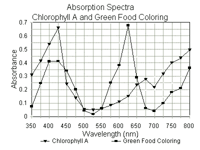
Here is an acceptable computer-generated graph:
Here is an acceptable hand-drawn graph (While the process of
scanning this graph and displaying it on your computer screen may make some
of the lines seem wavy, they were all drawn with a straight-edge.):
These should be accompanied by comments pointing out and
summarizing key features, such as:
Both chlorophyll A and the green food coloring have absorption
peaks in the violet range. However, the maximum for chlorophyll A is around
425 nm as compared to 400 nm for the green food coloring.
Both also have peaks in the red range. However, these are quite different.
The maximum for chlorophyll A is at 675 nm (deep red), while the maximum
for the green food color is at 625 nm (orangish-red).
Both have minima in the 525 nm (geen) range, hence the similarity in
appearance of these two pigments.
Interestingly, the green food coloring has a second minimum at around 675 to
700 nm, right where chlorophyll As red-range peak is.
For chlorophyll A, the peak at 425 nm (violet) is about twice as high as the
peak at 675 nm (red), while for the green food coloring the peak at 400 nm
(violet) is only about 2/3 as high as the one at 625 nm.
Not So Good Excerpts
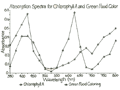
Here is an unacceptable computer-generated graph:
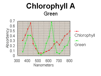
- Do not use a dark background like this.
- Since most scientific journals still publish papers in black and white,
not color, it would be better to not use colored lines, but rather, to use
different symbols to represent the different items.
- Green what?
- Chlorophyll A is not a good title. Rather, the title should state that
this is an absorption spectrum for chlorophyll A.
- The correct term is absorbance, not absorbency.
- The title should be smaller and the graph, itself, larger relative to each
other. Put the legend at the bottom so there is more space to make a larger
graph.
- Since we didnt measure any absorbances at 300 nm, begin the X-axis at
350 nm.
- Nanometers is not an acceptable title for the X-axis. Rather, those are
the units in which wavelength is measured.
Here is an unacceptable hand-drawn graph:
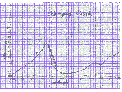
- The scribbles, mistakes, and crossing out might be OK for a rough draft
in your lab notebook, but an official-looking graph in a final paper must
be neatly and correctly done.
- The penmanship is sloppy, and in many places, is too small and messy to be
legible.
- The title does not really tell what the graph is all about.
- The lines were not drawn with a straightedge.
- There arent circles around the data points and the line, itself, goes
through the data points.
- The X-axis title doesnt specify the units of measurement (nanometers)
used.
- This type of graph does not, necessarily, go through the zero point at the
beginning. If the first measurement taken was at 350 nm, it cannot be
assumed that the absorbance at 237 nm is 0.
Comments such as the following dont really say anything of
value about the data:
- Chlorophyll A had a peak at 425, while the green food coloring had a peak
at 625.
[The author doesnt specify these were
absorption peaks (maxima). Both also had absorption peaks in other
places. The green food coloring also had an absorption maximum at around
400 to 425 nm, and the chlorophyll A also had a maximum at 675 nm. This
author appears to have totally missed the fact that both pigments are
absorbing a lot of light in the 400 to 425 nm range, and both are absorbing
a lot of light in the 625 to 675 nm range (which may have something to do
with why they both appear to us to be similar colors and might influence an
aquatic plants ability to carry on photosynthesis if placed in a solution
containing green food coloring).]
- There was more chlorophyll A at 425 and more green food coloring at 625.
[Not true, at all! The amount of chlorophyll
(or green food coloring) in the solution remains constant, no matter how much
light it absorbs at any given wavelength. Also, no units are specified 425
whats?]
- The green food coloring went up and down three times.
[Hey, wow, jumping food coloring? I dont
think so. . . What really went up and down three times, and is
that a really significant feature of the data collected? Will that, later,
influence the conclusions that are drawn?]
- Lab As chlorophyll absorbed more light at 425 than Lab Bs chlorophyll.
[So. . . ? There were more people in Lab A
than Lab B, so when we re-dissolved the pigment bands, their solutions had
higher concentrations. However, I doubt that has anything to do with where
(at what wavelength) the absorption maxima occurred, and thus would be
unlikely to influence any conclusions drawn about the results of the
experiment. Thus, this author needed to think more critically about what was
really important enough to point out. Additionally, in a scientific paper,
if the experimenters worked as a team to obtain their results, this would not
be noted in the competitive terms of Lab A vs. Lab B.]
- Chlorophyll A had an absorption peak at 0.659.
[Huh? I think this author may have meant to
say that (due merely to the number of people who did the experiment, which
was the major factor affecting the concentration of the solution tested)
chlorophyll As absorption at 425 nm was 0.659. . . and what about the peak
at 675 nm?]
- After we zeroed the spectrophotometer, we put the chlorophyll in the
spectrophotometer, and took a reading. The following data were collected:
(. . . etc.) and here is a graph of the data: (followed by a graph)
[There are several problems here. First,
methods and materials shouldnt be included in the Data section. Secondly,
those steps which were included are the sorts of common-sense,
how-to-use-the-spectrophotometer types of things that a scientifically-literate
reader would/should know. Thirdly, it is redundant and unnecessary to
include both a chart/list of data and a graph that says exactly the same
thing. Saying and here is a graph of the data is an especially bad way of
making the transition from one to the other.]
Copyright © 1998 by J. Stein Carter. All rights reserved.
This page has been accessed  times since 18 Feb 2011.