In all my classes, grades are calculated based on the class mean and standard deviation, obtained from a statistical analysis of the data. I think the best way to explain how this is done is by using a fictitious example. Suppose that two rather large groups of students were given a test, and the following results were obtained:
| Test Score | 0 | 1 | 2 | 3 | 4 | 5 | 6 | 7 | 8 | 9 | 10 | 11 | 12 | 13 | 14 | 15 | 16 | 17 | 18 | 19 | 20 | 21 | 22 | 23 | 24 | 25 | 26 | 27 | 28 | 29 | 30 | 31 | 32 | 33 | 34 | 35 | 36 | 37 | 38 | 39 | 40 | 41 | 42 | 43 | 44 | 45 | 46 | 47 | 48 | 49 | 50 | 51 | 52 | 53 | 54 | 55 | 56 | 57 | 58 | 59 | 60 | 61 | 62 | 63 | 64 | 65 | 66 | 67 | 68 | 69 | 70 | 71 | 72 | 73 | 74 | 75 | 76 | 77 | 78 | 79 | 80 | 81 | 82 | 83 | 84 | 85 | 86 | 87 | 88 | 89 | 90 | 91 | 92 | 93 | 94 | 95 | 96 | 97 | 98 | 99 | 100 |
|---|---|---|---|---|---|---|---|---|---|---|---|---|---|---|---|---|---|---|---|---|---|---|---|---|---|---|---|---|---|---|---|---|---|---|---|---|---|---|---|---|---|---|---|---|---|---|---|---|---|---|---|---|---|---|---|---|---|---|---|---|---|---|---|---|---|---|---|---|---|---|---|---|---|---|---|---|---|---|---|---|---|---|---|---|---|---|---|---|---|---|---|---|---|---|---|---|---|---|---|---|---|
| # Students Group 1 | 1 | 1 | 1 | 2 | 2 | 2 | 2 | 2 | 3 | 3 | 4 | 4 | 4 | 5 | 5 | 6 | 7 | 7 | 8 | 9 | 9 | 10 | 11 | 12 | 13 | 14 | 15 | 16 | 17 | 18 | 19 | 20 | 21 | 22 | 23 | 24 | 25 | 26 | 27 | 28 | 29 | 30 | 30 | 31 | 31 | 32 | 32 | 33 | 33 | 33 | 33 | 33 | 33 | 33 | 32 | 32 | 31 | 31 | 30 | 30 | 29 | 28 | 27 | 26 | 25 | 24 | 23 | 22 | 21 | 20 | 19 | 18 | 17 | 16 | 15 | 14 | 13 | 12 | 11 | 10 | 9 | 9 | 8 | 7 | 7 | 6 | 5 | 5 | 4 | 4 | 4 | 3 | 3 | 2 | 2 | 2 | 2 | 2 | 1 | 1 | 1 |
| # Students Group 2 | 1 | 1 | 1 | 1 | 1 | 1 | 1 | 1 | 1 | 1 | 2 | 2 | 2 | 2 | 2 | 3 | 3 | 3 | 4 | 4 | 5 | 5 | 6 | 7 | 7 | 8 | 9 | 10 | 11 | 13 | 14 | 16 | 17 | 19 | 21 | 22 | 24 | 26 | 28 | 30 | 32 | 33 | 35 | 37 | 38 | 39 | 41 | 41 | 42 | 42 | 43 | 42 | 42 | 41 | 41 | 39 | 38 | 37 | 35 | 33 | 32 | 30 | 28 | 26 | 24 | 22 | 21 | 19 | 17 | 16 | 14 | 13 | 11 | 10 | 9 | 8 | 7 | 7 | 6 | 5 | 5 | 4 | 4 | 3 | 3 | 3 | 2 | 2 | 2 | 2 | 2 | 1 | 1 | 1 | 1 | 1 | 1 | 1 | 1 | 1 | 1 |
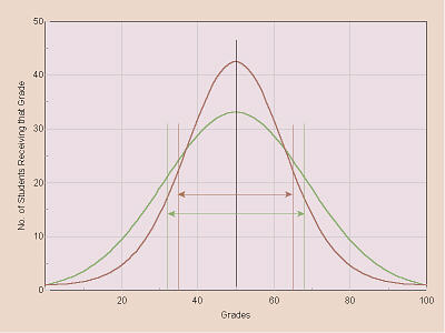
Thus, for example, 10 of the students in group 2 received a raw score of 27 on this particular test. For these data, a graph of number of students receiving each score vs. scores (a histogram) would look like this:
Note that the green line represents group 1 and the red line represents group 2. Notice that the peaks, the highest points, of both lines are at the same place both correspond to a score of 50 points. I think most people are familiar with how to calculate a mean (an average) of a group of numbers: add up the values and divide by the number of samples. In this case, if we add up the scores received and divide by the total number of students in each of the two groups, it turns out that the means (represented by X) of the two groups are the same; both are 50 points (represented by the black vertical line in the center of the graph).
However, these two graphs are not the same shape, and that also is significant. In group 2 (the red line) there are fewer students on the ends: the numbers of students receiving very low and very high scores are lower/less than the numbers of students in group 1 (the green line). Conversely, there are more students in group 2 clustered more closely to the center, the mean, of the group than there are for group 1. In statistics, the concept of standard deviation (represented by s) is a measure of how spread out vs. clustered a group of data are. In this case, the standard deviation for group 1 is 18.32 points, while the standard deviation for group 2 is 15.12 points, and since this latter number is smaller (the standard deviation is less) than the former, that indicates the scores received by the students in group 2 are more closely clustered (less spread out) than those of group 1.
In statistics, the numbers 18.32 for group 1 and 15.12 for group 2 are referred to as one standard deviation unit. Thus, for group 1, we could refer to a score of 68.32 (= 50 + 18.32) as being one standard deviation unit above the mean (X + s) and 31.68 (= 50 18.32) as being one standard deviation unit below the mean (X s). Similarly, for group 2, a score of 65.12 is +1 standard deviation unit from the mean and 34.88 is 1 standard deviation unit from the mean. These points are indicated on the above graph by the vertical lines with arrows pointing to them, and the length of each arrow is one standard deviation unit (s).
Those statistical calculations are used to determine grades. The mean (X) is used as the dividing point between B and C grades, while X + s is used as the dividing point between A and B grades, X s is used as the dividing point between C and D grades, and X 2s is used as the dividing point between D and F grades as indicated in the following graph:
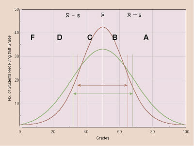
Thus, for a student in group 1 (green line), a raw score of 66 points would be less than X + s (68.32) so that person would receive a letter grade of B, while for a student in group 2 (red line), a raw score of 66 points would be greater than X + s (65.12), so that person would receive a letter grade of A.
In statistics, there is also something called z-scores, which is a way of converting the X, X + s, and X s points to make them easier to understand. For example, to come up with statistical numbers that are more easily understood at a glance, I can create z-scores by adding 8 to each of those numbers. Thus, X, which, because it is the mean, has a deviation of 0 from the mean, becomes X + 8 = 8, while X + s, which, thus, has a deviation from the mean of +1, becomes X + s + 8 = 9, and X s, which has a deviation of 1 standard deviation unit, becomes X s + 8 = 7. This quickly and neatly converts the 1, 0, and +1 break points to a 10-point scale, such that X + s (the dividing point between A and B) becomes 9.0, X (the dividing point between B and C) becomes 8.0, X s (the dividing point between C and D) becomes 7.0, and X 2s (the dividing point between D and F) becomes 6.0.
Thus, our sample 66 raw points, above, would be equivalent to a z-score of 8.87 for group 1 or 9.06 for group 2. Again, keep in mind that since the scores of the students in group 2 are more closely clustered, thus a score of 66, as compared to the rest of them, is, relatively-speaking, more out on a limb that person really did do that much better, compared with his/her classmates, whereas the person in group 1 who also got a 66 was closer to the center of the pack for that class.
This grading system does have several important implications of which you need to be aware and which you need to understand. First, average is average, no matter where it falls. Consider the following sample grades:
| Student | Assignment 1 | Assignment 2 | Assignment 3 | Assignment 4 | Totals | |||||||||||||||||
|---|---|---|---|---|---|---|---|---|---|---|---|---|---|---|---|---|---|---|---|---|---|---|
| Pts | Z | Gr. | Pts | Z | Gr. | Pts | Z | Gr. | Pts | Z | Gr. | Pts | Z | Gr. | Rank | % | ||||||
| John | 45 | 6.73 | D | 147 | 8.91 | B | 39 | 9.00 | B | 194 | 9.83 | A | 425 | 9.51 | A | 2 | 85.0% | |||||
| Sally | 49 | 9.68 | A | 119 | 7.51 | C | 32 | 7.91 | C | 156 | 8.56 | B | 356 | 8.08 | B | 3 | 71.2% | |||||
| Kim | 48 | 8.94 | B | 131 | 8.11 | B | 26 | 6.98 | D | 143 | 8.13 | B | 348 | 7.92 | C | 4 | 69.6% | |||||
| Bill | 47 | 8.21 | B | 123 | 7.71 | C | 37 | 8.69 | B | 105 | 6.86 | D | 312 | 7.18 | C | 5 | 62.4% | |||||
| Mary | 48 | 8.94 | B | 174 | 10.26 | A | 45 | 9.93 | A | 173 | 9.13 | A | 440 | 9.81 | A | 1 | 88.0% | |||||
| Max Poss | 50 | 200 | 50 | 200 | 500 | |||||||||||||||||
| No. of Students | 5 | 5 | 5 | 5 | 5 | |||||||||||||||||
| Mean | 47.40 | 138.80 | 35.80 | 154.20 | 376.20 | |||||||||||||||||
| % of Totl. | 95% | 69% | 72% | 77% | 75% | |||||||||||||||||
| Std Dev | 1.36 | 20.04 | 6.43 | 29.96 | 48.53 | |||||||||||||||||
| X + s | 48.76 | 158.84 | 42.23 | 184.16 | 424.73 | |||||||||||||||||
| X s | 46.04 | 118.76 | 29.37 | 124.24 | 327.67 | |||||||||||||||||
| X 2s | 44.69 | 98.71 | 22.94 | 94.29 | 279.14 | |||||||||||||||||
Notice that for the first assignment, a raw score of 47.40 out of 50 possible (95%) is average the dividing line between B and C! However, on the second assignment, a raw score of 138.80 out of 200 (only 69%) is average. Interestingly, in the past, some students have, apparently, thought that I should randomly, pick and choose and change grading systems based on whatever they perceive as being best for them on any particular assignment. Thus, in this example, they would say the first assignment should be graded one way (using, say, a 90-80-70 system), and the second assignment should be graded a totally different way (using mean and standard deviation). The fallacy in that, however, is that it is impossible to compare the proverbial apples and oranges, and without consistency in grading policy, there would be no good, fair way to assign grades at the end of the quarter. Look again at the example: while all of these fictitious students did very well on the first assignment and the class average is very high, resulting in a strange-looking curve, by the end of the quarter (when it counts) the overall class average is only 75%, and if I were to grade these students on a straight 90-80-70 scale, instead, there would be no A grades, the B would be a low C, and both of the people who had Cs with the curve would get Ds, instead. So, . . I am going to consistently use ONE grading system for the whole quarter, and in every class so far, using a curve based on the class mean and standard deviation, as Ive just described, has been to the students advantage by the end of the quarter, even if one assignment early-on looks strange.
For each of the assignments you will be asked to do, there is a sample of the grading criteria for that assignment on the Web page that presents the assignment. Consulting those grading criteria as you prepare the work you will submit should help you to do a better job on the assignment. As those assignments are graded, the points you earned will be added to a file which you can access online to check your grades. I might add that, while the regular Web pages for this course are available to everyone, the grade list is not. The actual grades file is housed in an offline directory that is not accessible by the Web server, and the grades, themselves, are encoded. The file is only accessible via a Perl script which first checks to verify that the request is coming from a registered student and shows that student only his/her own grades.