Graph Construction
Background:
One of the ways that scientists present data is in the form of a graph. Probably the most frequently used type of graph is the XY graph. In this type of graph, a quantity, such as time, that is independent of the experiment, is plotted along the horizontal, or X- axis, and a second variable, the values of which depend on the first, is plotted along the vertical, or Y- axis. Thus, for each experimental point along the X-axis, there is a corresponding measured value along the Y-axis, and the intersection of these two distances/values describes the location of one datum point on the graph.
In addition to XY graphs, two other important types of graphs are line graphs and bar graphs. The type of graph used must match with the type of data that one wishes to graph.
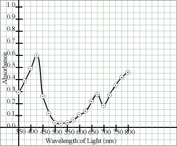
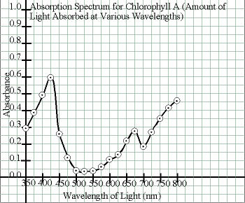
XY graphs are used when there are continuous variations in both the X and Y data. For example, an XY graph would be used for a graph of light absorbed by a pigment vs. wavelength of light, where both are continuously varying. In that case, if readings are taken at wavelengths of 400 and 425 nm, the in-between wavelengths of 403, 411, 417 nm, etc. that were not tested also absorb light in other amounts.
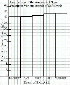
A bar graph is used when there are discrete intervals, with no in-betweens on either the X or Y axis. For example, a bar graph would be used for a graph of the amount of sugar contained in a variety of brands of soft drinks. In that case, there is no such thing as a Coke + 0.5 soft drink thats half way between Coke and Pepsi. Also, theres no continuous variation in the amount of sugar contained. Coke contains a given amount of sugar, Pepsi contains a given amount of sugar, and theres no gradation in between them.
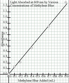
A straight line graph is used when there is a direct, linear correlation between the X and Y values. For example, the amount of light a solution absorbs is directly related to its concentration. Thus, even though a plot of ones experimental data may not be an exactly straight line due to experimental error, the best-fit straight line through all those points is calculated and drawn, rather than connecting the data points.
To be meaningful, a graph must be created in an orderly, logical fashion, which is the subject of this Web page and protocol. A hand-drawn graph must be constructed on an appropriate type of graph paper and with the aid of a straightedge. Permanent black ink should be used, and all lettering should be extremely neat.
Identify Which Variable Is Which:
Determine which of your sets of data are the independent and which are the dependent variables. The independent variables are those that are independent of experimental conditions, those you set and control. The X-axis (the horizontal axis) should be used to represent the independent variables. The dependent variables are those that depend on the experimental conditions the readings you take. The Y-axis (the vertical axis) should be used to represent the dependent variable. Consider the following three sets of data:
| Sample Data for Straight-Line Graph | |||||
|---|---|---|---|---|---|
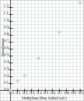
| Independent = mL of Methylene Blue |
0.1 mL | 0.2 mL | 0.4 mL | 0.7 mL | 1.0 mL |
| Dependent = Absorbance Readings |
0.134 | 0.215 | 0.463 | 0.840 | 1.269 |
| Sample Data for Bar Graph | |||||
|---|---|---|---|---|---|
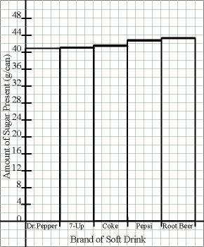
| Independent = Type of Soft Drink |
Dr. Pepper |
Seven Up |
Classic Coke |
Pepsi | Root Beer |
| Dependent = Avg. gm/Can |
40.74 | 40.89 | 41.31 | 42.63 | 43.08 |
| Sample Data for Curved-Line (XY) Graph | |||||||||||||||||||
|---|---|---|---|---|---|---|---|---|---|---|---|---|---|---|---|---|---|---|---|
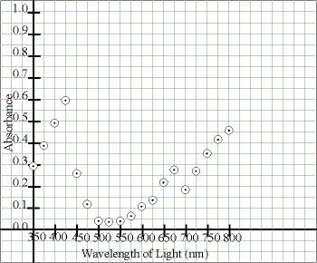
| Independent = Wavelength |
350 nm |
375 nm |
400 nm |
425 nm |
450 nm |
475 nm |
500 nm |
525 nm |
550 nm |
575 nm |
600 nm |
625 nm |
650 nm |
675 nm |
700 nm |
725 nm |
750 nm |
775 nm |
800 nm |
| Dependent = Absorbance |
0.296 | 0.388 | 0.484 | 0.589 | 0.254 | 0.116 | 0.044 | 0.037 | 0.042 | 0.062 | 0.102 | 0.129 | 0.216 | 0.272 | 0.181 | 0.265 | 0.350 | 0.411 | 0.453 |
Determine Type of Graph to Use:
Decide which type of graph is the most appropriate for your data.
If your data are (or could be) continuous, an XY graph would probably be the most appropriate type. You would want to use an XY graph to indicate that intermediate values would be possible.
If your data are discontinuous, a bar graph would be the most appropriate type. You would want to use a bar graph to indicate that each item tested is a separate entity.
| Sample Data for Straight-Line Graph | |||||
|---|---|---|---|---|---|
| Data were obtained at | 0.1 mL | 0.2 mL | 0.4 mL | 0.7 mL | 1.0 mL |
| Data
could have been obtained at 0.56 mL or 0.73 mL etc. These data are continuous, so use a (straight) line graph. |
|||||
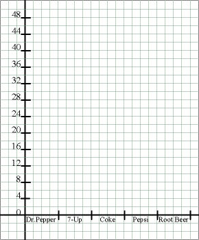
| Sample Data for Bar Graph | |||||
|---|---|---|---|---|---|
| Data were obtained for | Dr. Pepper |
Seven Up |
Classic Coke |
Pepsi | Root Beer |
| Theres
no such soft drink as 0.333 Coke or 0.400 Root Beer. These data are discontinuous, so use a bar graph. |
|||||
| Sample Data for Curved-Line (XY) Graph | ||||||||
|---|---|---|---|---|---|---|---|---|
| Data were obtained at | 350 nm |
375 nm |
400 nm |
425 nm |
450 nm |
475 nm |
500 nm |
525 nm |
| Data
could have been obtained at 462 nm or 527 nm etc. These data are continuous, so use an XY graph. |
||||||||
As yet one more example of the difference between an X-Y graph and a line graph, consider the following data:
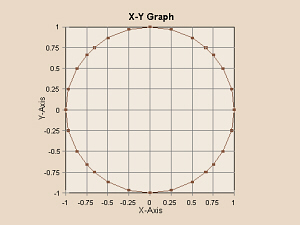
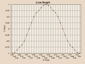
| x | 0.00 | 0.25 | 0.50 | 0.66 | 0.75 | 0.87 | 0.97 | 1.00 | 0.97 | 0.87 | 0.75 | 0.66 | 0.50 | 0.25 | 0.00 |
|---|---|---|---|---|---|---|---|---|---|---|---|---|---|---|---|
| y | -1.00 | -0.97 | -0.87 | -0.75 | -0.66 | -0.50 | -0.25 | 0.00 | 0.25 | 0.50 | 0.66 | 0.75 | 0.87 | 0.97 | 1.00 |
| x | -0.25 | -0.50 | -0.66 | -0.75 | -0.87 | -0.97 | -1.00 | -0.97 | -0.87 | -0.75 | -0.66 | -0.50 | -0.25 | 0.00 | |
| y | 0.97 | 0.87 | 0.75 | 0.66 | 0.50 | 0.25 | 0.00 | -0.25 | -0.50 | -0.66 | -0.75 | -0.87 | -0.97 | -1.00 |
An X-Y graph of these data would be a circle, as in the graph to the left. A line graph of these data would be a strange-shaped line as in the graph to the right, below.
|
|
Determine the Limits of the X- and Y-Axes:
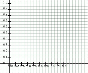
Examine the data set for the X-axis and note the minimum and maximum values. Repeat for the Y-axis. Do the data start at zero or would it be more appropriate to start at some other number? For example, if light absorbance at wavelengths from 350 to 800 nm were obtained, it would make no sense to begin a graph of those data at zero. For each axis, subtract the low value from the high value to obtain the range of values needed.
| Sample Data for Straight-Line Graph | ||
|---|---|---|
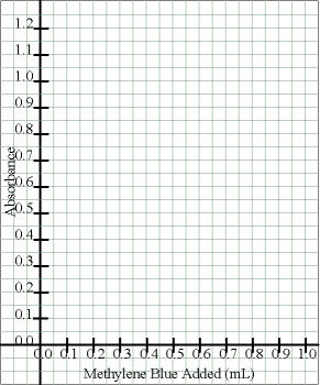
| Lowest X is 0.0 mL | Highest X is 1.0 mL | Range is 1.0 mL |
| Lowest Y is 0.000 | Highest Y is 1.269 | Range is 1.269 |
| Sample Data for Bar Graph | ||
|---|---|---|
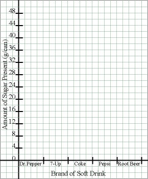
| There were 5 brands tested | ||
| Lowest Y is 40.74 | Highest Y is 43.08 | Range* is 43.08 |
| * We want to start the bars at 0 anyway to better see the actual differences in height. | ||
| Sample Data for Curved-Line (XY) Graph | ||
|---|---|---|
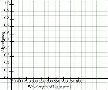
| Lowest X is 350 nm | Highest X is 800 nm | Range is 450 nm |
| Lowest Y is 0.000 | Highest Y is 0.589 | Range is 0.589 |
Determine Orientation on the paper:
Decide which way to place the graph on your notebook page.
If at all possible, it is obviously more convenient to construct a graph
such that your notebook page remains right-side up (portrait orientation).
In some cases, however, it might make more sense to turn the page
sideways (landscape orientation).
| Sample Data for Straight-Line Graph |
|---|
| The ranges for the X and Y values are similar and both are relatively small ranges. These data can be graphed in normal portrait orientation. |
| Sample Data for Bar Graph |
|---|
| There were only five brands of soft drink tested and the Y range is fairly large. Thus it would probably make sense to graph these data in normal portrait orientation. |
| Sample Data for Curved-Line (XY) Graph |
|---|
| The X range is quite large and the Y range is small. Thus it would probably make sense to turn your lab notebook sideways and graph these data in landscape orientation. |
Set Up the X- and Y-Axes:
Using a straightedge and following one of the preprinted lines on your notebook page, draw a vertical line about three or four spaces from the left edge of the page to represent the Y-axis and a horizontal line about three or four spaces up from the bottom of the page to represent the X-axis. Do not mark any units along the axes, yet.
| Use either (for portrait orientation) |
|---|
 |
| or (for landscape orientation) |
 |
Count the Available Lines:
Count the actual number of lines available on your notebook page (which will be different from this illustration) for the X-axis and for the Y-axis.
| Either (for portrait orientation) |
|---|
 |
| or (for landscape orientation) |
 |
Calculate Approximate Units Per Line:
To approximate the units needed, for each axis, divide the
range of values needed by the number of spaces available.
If you are constructing a bar graph, the calculation for the X-axis is
exactly the reverse of that.
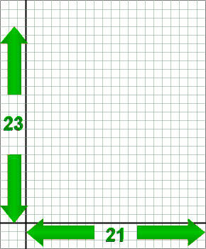
| Sample Data for Straight-Line Graph | ||
|---|---|---|
| X range is 1.0 mL |
No. of spaces is 21 |
1.0 mL/21 spaces = 0.0476 mL/space |
| Y range is 1.269 |
No. of spaces is 23 |
1.269/23 spaces = 0.0552 units/space |
| Sample Data for Bar Graph | ||
|---|---|---|
| There were 5 brands tested |
No. of spaces is 21 |
21 spaces/5 brands = 4.2 spaces/brand |
| Y range is 42.08 g |
No. of spaces is 23 |
42.08 g/23 spaces = 1.83 g/space |
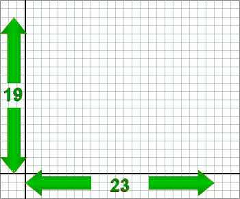
| Sample Data for Curved-Line (XY) Graph | ||
|---|---|---|
| X range is 450 nm |
No. of spaces is 23 |
450 nm/23 spaces = 19.57 nm/space |
| Y range is 0.589 |
No. of spaces is 19 |
0.589/19 spaces = 0.0310 units/space |
Determine Actual Units Per Line:
To enable you to correctly plot your data, the divisions on the axes should equal some convenient factor of 1, 2, 5 or 10. For example, divisions of 0.02 units would be acceptable, divisions of 0.025 or 0.033 units normally would not (and something like 0.3574 units definitely would not). If you are constructing a bar graph, you need to use the same whole number of spaces to represent each bar.
| Sample Data for Straight-Line Graph | |
|---|---|
| X minimum is 0.0476 mL/space |
Next highest acceptable value is 0.05 mL/space |
| Y minimum is 0.0552 units/space |
This gets tricky. This is so close to 0.05 units/space. I think I can use that if I go a little higher, but I might run into where Im supposed to put the page number. I think, though, thats better than making the graph a whole lot smaller. |
| Sample Data for Bar Graph | |
|---|---|
| X maximum is 4.2 spaces/brand |
It would work to use either 4 spaces/brand with no spaces in between or 3 spaces/brand with one space in between each. |
| Y minimum is 1.83 g/space |
Next highest acceptable value is 2 g/space |
| Sample Data for Curved-Line (XY) Graph | |
|---|---|
| X minimum is 19.57 nm/space |
Normally, I should use 20 nm as the next, best size. However, this is one of the few cases where an exception to that rule can be made. Because the readings were taken at intervals of 25 nm, it is OK to use that as divisions here. |
| Y minimum is 0.0310 units/space |
Next highest acceptable value is 0.05 units/space |
Mark the Axes with Regular Values:
For example, if each space/line on the X-axis represents 0.05 mL, these would correspond to 0.00, 0.05, 0.10, 0.15, 0.20, 0.25 mL, etc. Optionally, you might choose to only label the 0.00, 0.10, 0.20, etc. points so your axis isnt as cluttered, but remember to allot space for the 0.05, 0.15, etc. points in between. Place a small tick mark across the axis at each point that you label. Be certain to maintain linearity (note that if your units are 0.02, 0.04, 0.06, 0.08, 0.10, the next division is 0.12, not 0.20!). For a bar graph, delimit the edges of each bar and label what each bar represents. Remember to keep your bars a uniform width.
| Either (for portrait orientation) |
|---|
 |
| or |
 |
| or (for landscape orientation) |
 |
Title the Axes:
Label each axis with a title that tells what the axis represents and what units are being used.
| Either (for portrait orientation) |
|---|
 |
| or |
 |
| or (for landscape orientation) |
 |
Enter the Data Points:
For an XY graph or a straight-line graph, for the first point,
locate the appropriate value along the x-axis and then move up along that
line until the appropriate value of y is reached (interpolate as needed).
Double check that you have not shifted from the desired location, and make a
dot at the point. Draw a small circle around the point, making it easier to
see, and preserving the integrity of the point. Repeat until all data have
been entered.
Optionally, if you will be entering several sets of data on one graph, you may
use squares or triangles around some of the sets of data to distinguish them.
In that case, you will need a key at the bottom to indicate the meaning of
each symbol.
For a bar graph, determine the appropriate height, corresponding to the correct location on the Y-axis, then use a straightedge to draw the sides and tops of the bars. It is not necessary to color in the bars, so save ink and leave them uncolored. If you are graphing several sets of data on one graph, you may need to use a variety of lines (horizontal, vertical, slanted, etc.) in the bars to indicate the various data sets.
| Either (for portrait orientation) |
|---|
 |
| or |
 |
| or (for landscape orientation) |
 |
Connect the Circles:
There are two main types of line graphs we will be constructing,
so at this point you need to have an understanding of what your data are
supposed to represent a straight line or a curved line.
In one type, the function being graphed is supposed to be linear (but your
actual data may not be). In this case, use a straightedge to determine the
best fit straight line that comes closest to going through the points (There
is actually a way to calculate the best-fit straight line). Some points
should be above the line and some should be below. Try to have about the
same number of points about the same distances above and below the line
(the line should go through the middle of the scatter of points).
Draw a straight line with the straightedge, but do not violate the interior
of any circles through which the line goes draw the line to but not
into or through the circles.
In the other type of graph, the function is suppose to be non-linear some kind of a curve. In this case, it is appropriate to connect the circles (in order) to approximate the curve. In this case, the straightedge can help you connect consecutive pairs of circles, but some smoothing may be desirable at noticeable curves to obtain the best fit curve. However, that does not mean you shouldnt use the straightedge long, straight segments should be straight, not wavy! Again, do not violate the circles or obscure the points therein.
| Either (for portrait orientation) |
|---|
 |
| or (for landscape orientation) |
 |
Title the Graph:
Write the title in capital letters above the graph (ordinarily this would be the title of that page in your notebool). Be as descriptive as possible.
| Either (for portrait orientation) |
|---|
 |
| or |
 |
| or (for landscape orientation) |
 |
Other Things to Include in Your Notebook
Make sure you have all of the following in your lab notebook: